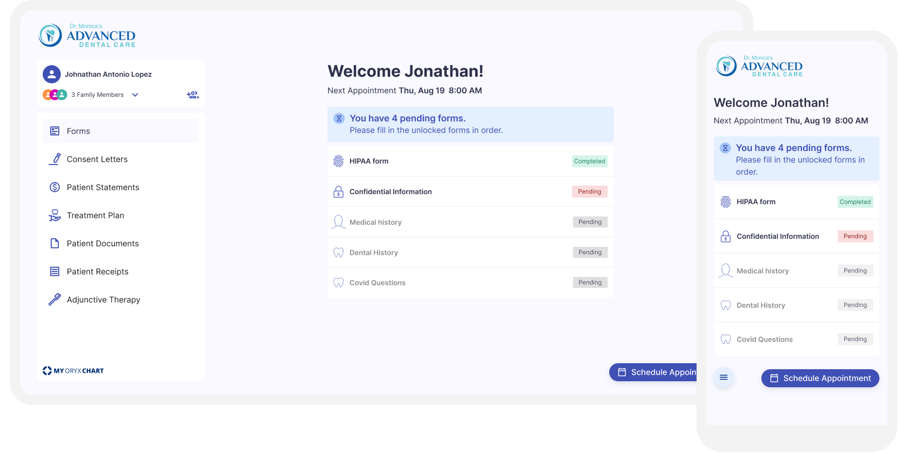
Online Scheduling & Patient Portal
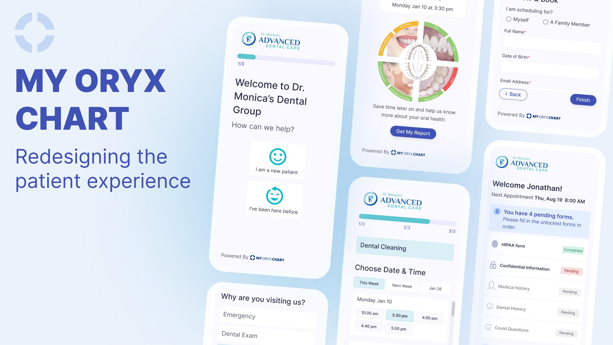
During my time at Oryx Dental Software, I worked on a project aimed at enhancing the patient experience. With low online scheduling and form conversion rates. I led the redesign effort to improve the patient journey, resulting in increased patient engagement and better business outcomes for the dental offices.
Results
80%
adoption of the platform from existing clients
30%
more patients scheduling online
-10 min
per appointment
Part 1-Online Scheduling
Dental practices that do not integrate an online scheduling platform often use a simple form on their website that requires patients to provide contact information and preferred times. The dental team then manually contacts these leads. However, this solution lacks the flexibility that scheduling platforms offer, such as choosing time availability, provider availability, and adding services.
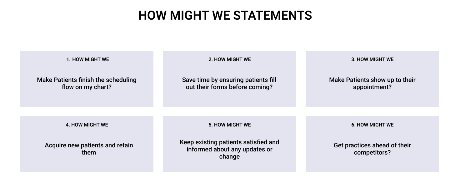
How can the booking process for dental practices be improved to prevent loss of revenue due to user drop-off?
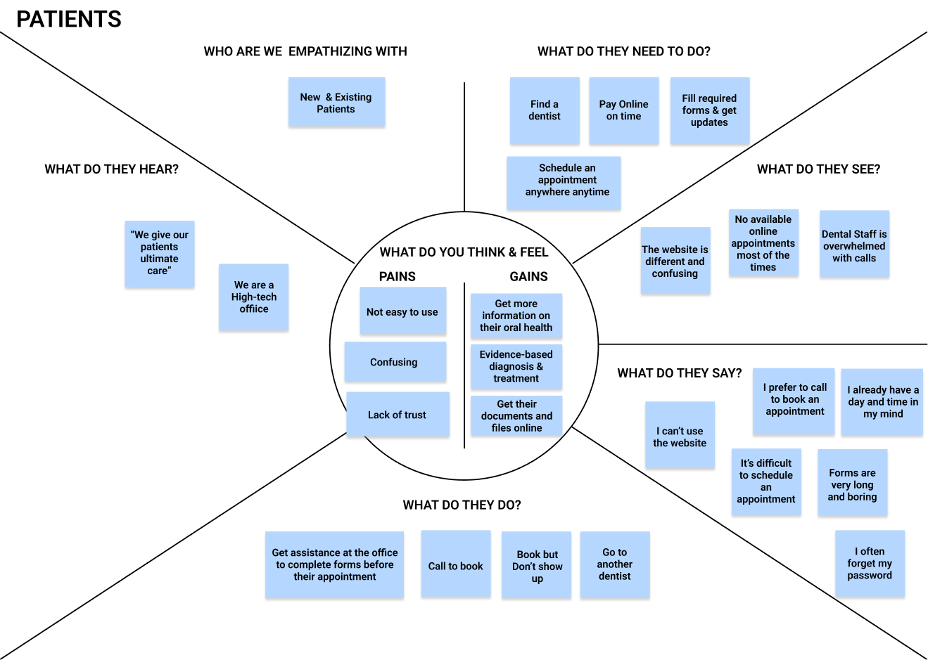
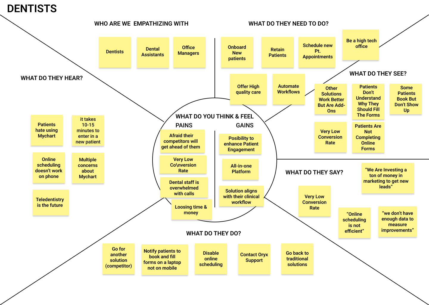
Dentists are frustrated with the usability issues of the platform and have either switched or are willing to switch to another software. To address the issues, user research was conducted as there was no data or customer insights available.

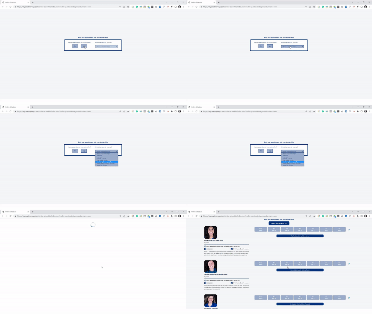
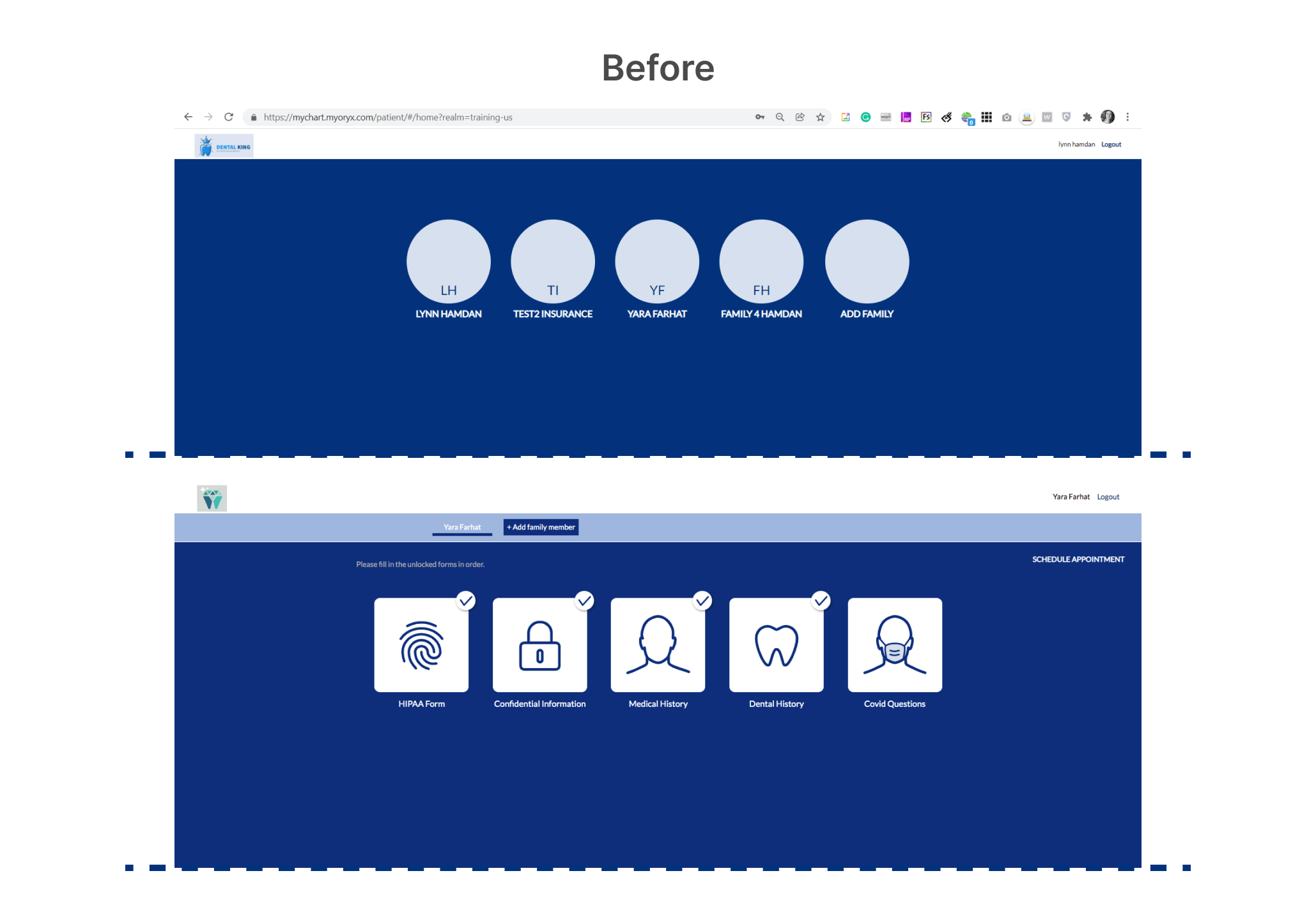
Old Platform quick preview

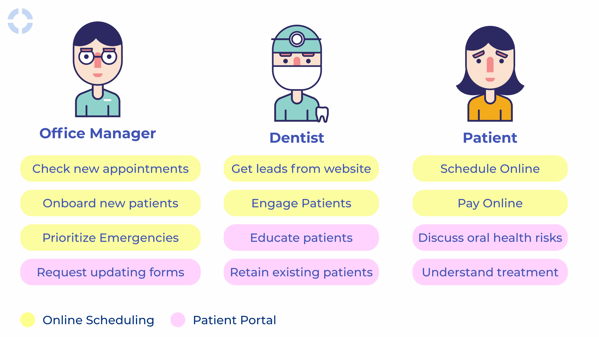
The original list of user profiles was narrowed down to the patient, the dentist and the office manager.
The following diagram shows which features in the patient engagement module each user profile uses.
It was crucial to understand how Oryx provides a different solution than any other scheduling platform by offering a comprehensive, systematic risk-assessment based approach to patient care.

The current user flow

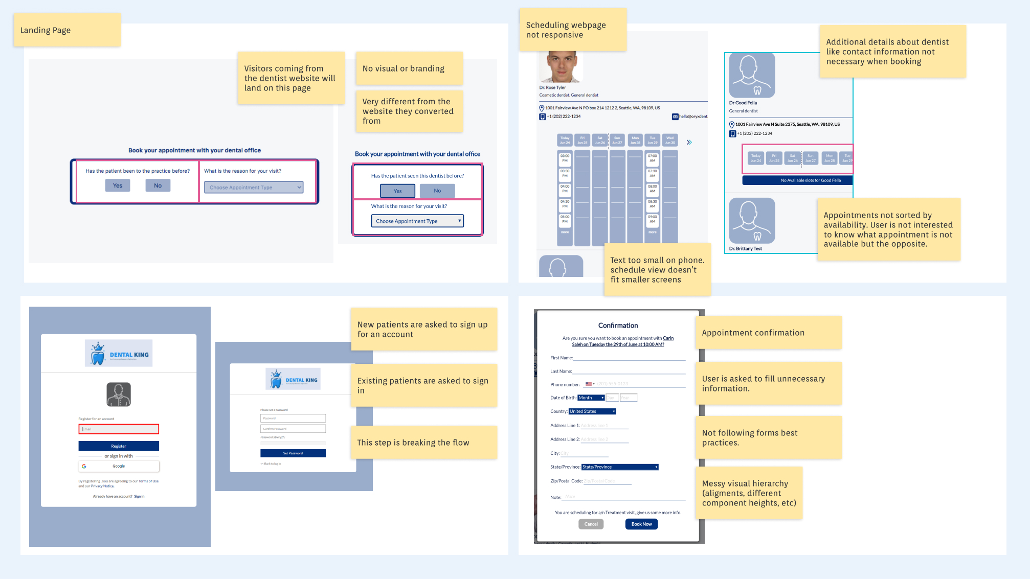
I mapped out the user flow for the user personas to discover the problems at each touchpoint
For the scheduling platform:
1- Major difference between the dentist site & the booking platform-Lack of trust
2- Not showing available appointments first
3-New users immediately dropped off when asked to create an account
4-Confirm appointment form have unnecessary fields like patient address.
Full name, DOB, Email & phone number are only needed for this step
5-Huge problems in responsiveness leading users to drop off.

For the Online forms & Engagement platform:
1- Very long forms with no progress indication
2-Difficult navigation (breadcrumb) the user have to go back and forth every time
3-Confirm appointment form have unnecessary fields like Patient address
4-Error states don’t show until clicking on submit
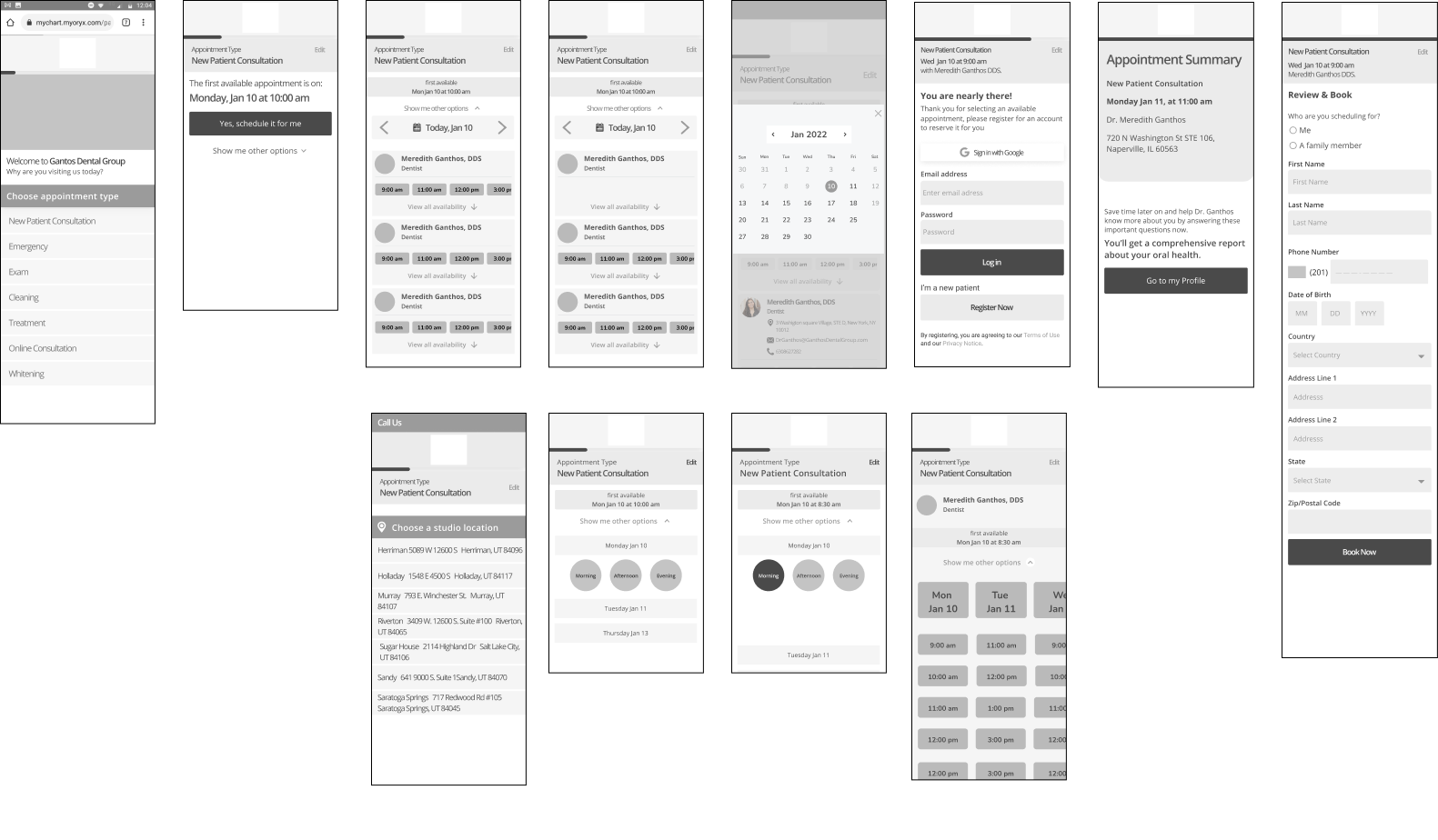
Created mid-fidelity prototypes to test ideas fast
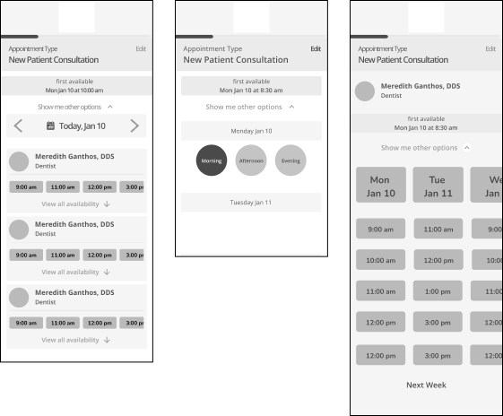
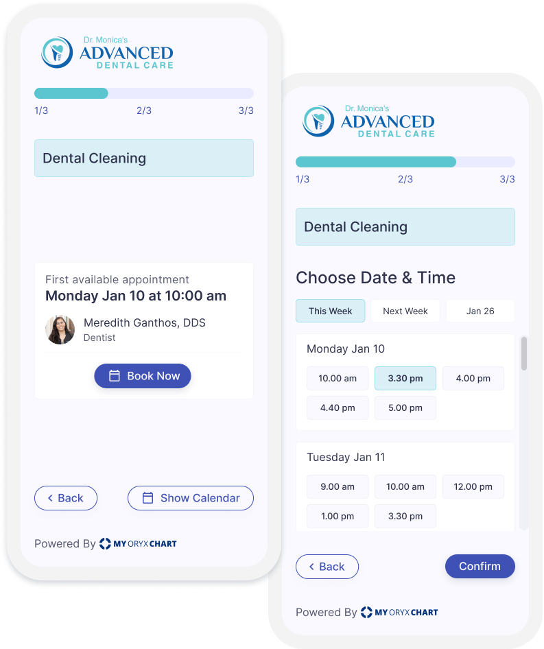
Multiple prototypes of the booking flow were created and tested with users. Users preferred to see what was available directly and skip provider information. To avoid confusion, the first available appointment and other time options were split into two separate screens.
Scheduling Mobile Prototype
The initial solution for online booking was problematic, as users had to go back in the process if the appropriate dentist was not available. The solution was modified to show users the first available appointment first then the nearest one to a chosen time, validated through usability testing of a high fidelity prototype.

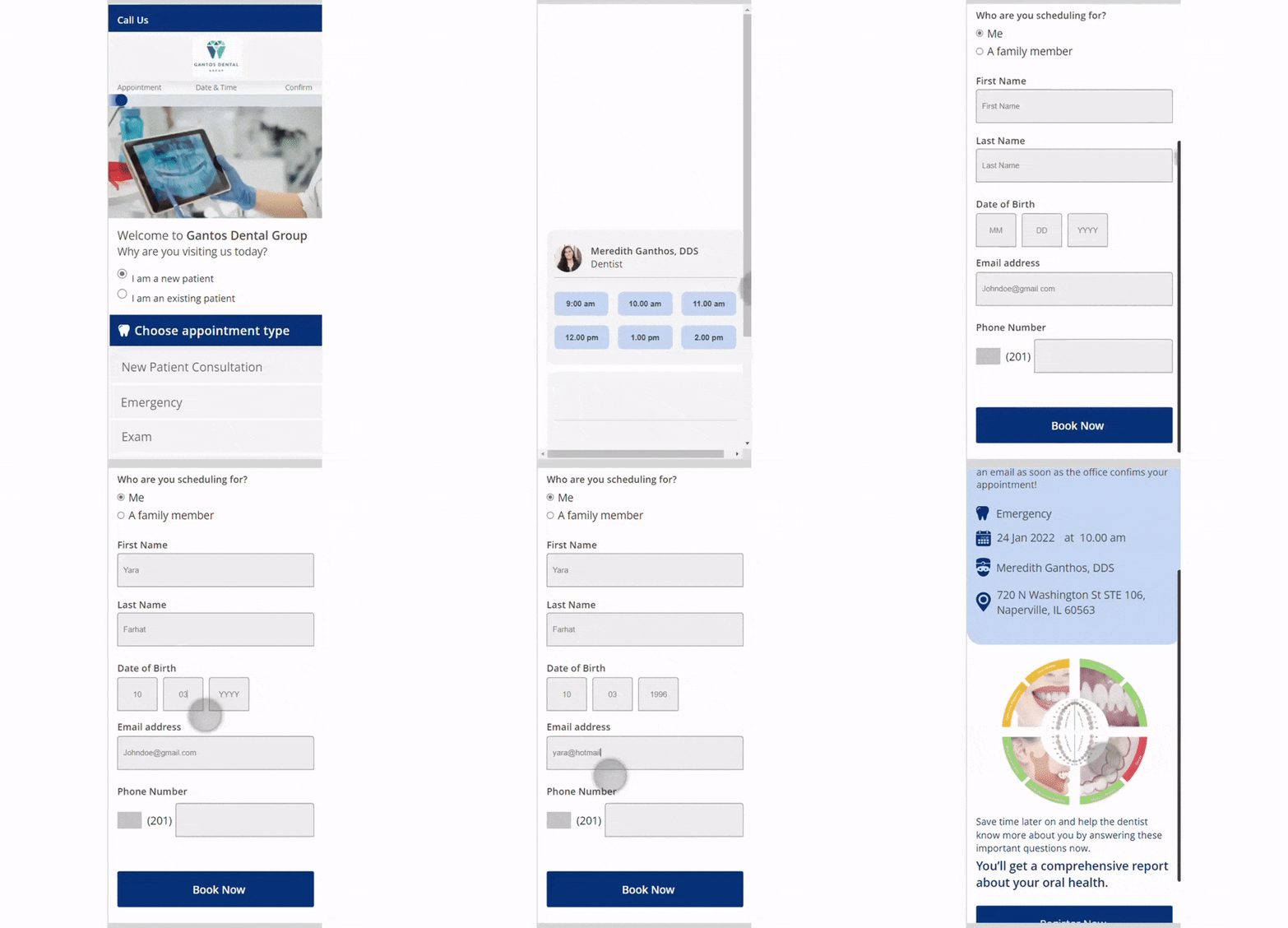
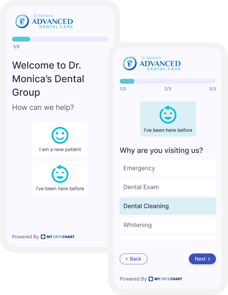
The landing page was redesigned to welcome the visitor.
- A clear welcome message help visitors to feel more comfortable and confident in booking an appointment.
- The progress indicator visible on every page of the flow, allowing the user to track their progress and understand how many steps are left.
- After the visitor selects whether they are a new or returning patient, the subsequent page is customized based on what the dental office has set.
Simplified booking flow.
- Prominently display the first available appointment to the user, providing a quick and easy way to book an appointment.
- Other options could be easily accessible by opening the calendar.
The Sign up/Log in step was omitted.
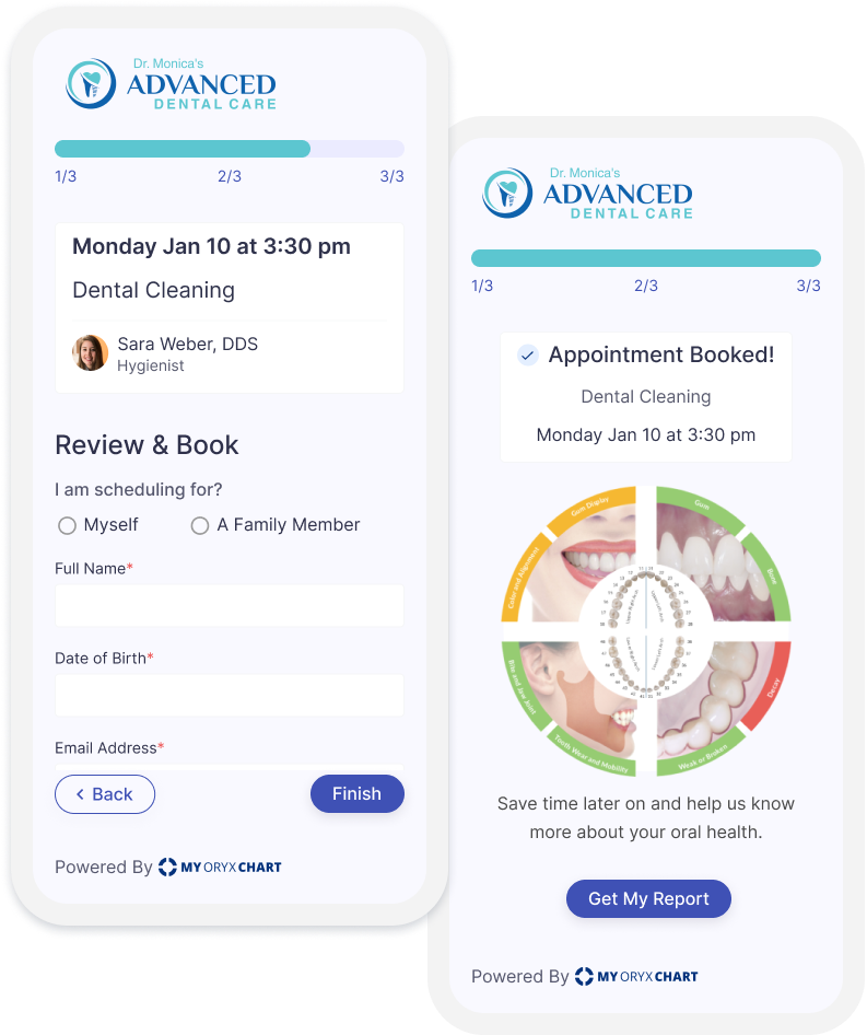
- The selected appointment ,provider and date and time show on the top of the screen.
- A simplified review form.
- To engage the patient the Call To Action in the last screen invites the patient to sign up for an account to get a report for their oral health.
Part 2: The Patient Portal
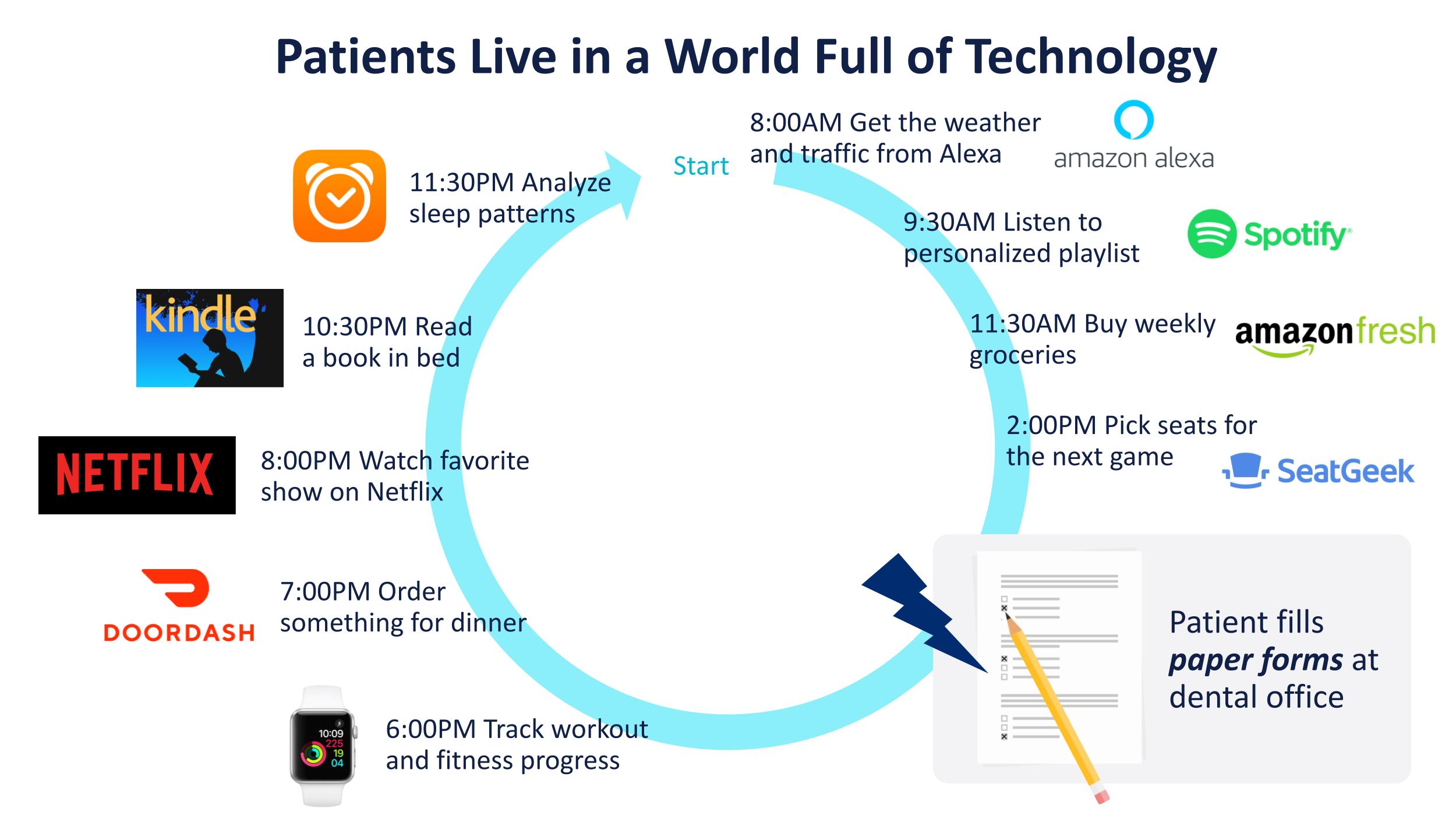
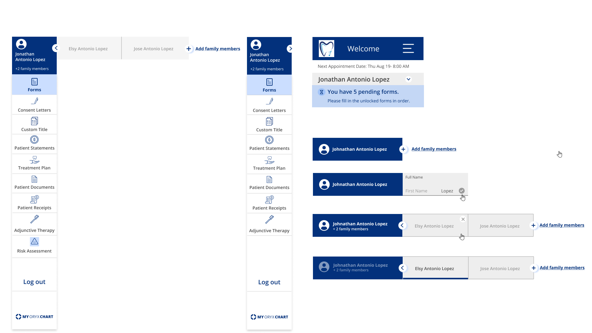
Dental practices used to email PDF intake forms, which was time-consuming and required manual effort. The low form completion rate was addressed with the patient portal. Collecting patient information is vital, but inadequate tools for collecting and storing this information cause problems for patients and providers.
How can dental offices ensure patients complete required forms before their appointments to avoid rescheduling or wasting time during the visit?
Results, learnings & reflections
1-Communication is key:
I learned that understanding and communicating to the team why the solution was built this way and how users were using it was crucial before jumping into the details of the redesign.
A redesign is often understood as a revamp, I tried as much as possible to advocate for changing that perception, because I already saw that what was built based on assumptions was failing.
2-UX is never done, if we don't measure the outcomes fast and iterate the solution will fail
I realized why the initial solution failed was a result of proposing a solution, building it and hoping it would bring good results. For this re-design I made sure to set success metrics that we can measure. As a starting point we measured the percentage of patients that booked online and how many succeeded to complete their online forms before coming to their appointment.
